Visualizing SASL/POP3/IMAP Automated Dictionary Attacks
|
I've been meaning to do this for a while now, but felt especially compelled because today happened to be a pretty heavy day of automated attacks on my
mail servers SMTP(SASL)/POP3/IMAP services. So I have something that blocks these and those blocks are logged, and they go back to November of 2011.
I know there's been a steady increase in the number of attacks over the years but I was also curious about what time most attacks happened and what days.
So I wrote something to parse through all of these brute force dictionary attacks and do a per IP count of attacks. To clarify a little, these are connections
to port 25, 110 or 143, at least 5 from a single IP over the course of a time window, that results in failed authentication attempts. 99% of the time,
these are bogus users. So after gathering the data, I stuck them into a spreadsheet and (tried to) make some graphs.
First, let's look at the entire dataset, broken down by the number of attacks from unique IPs per day (click for entire image):
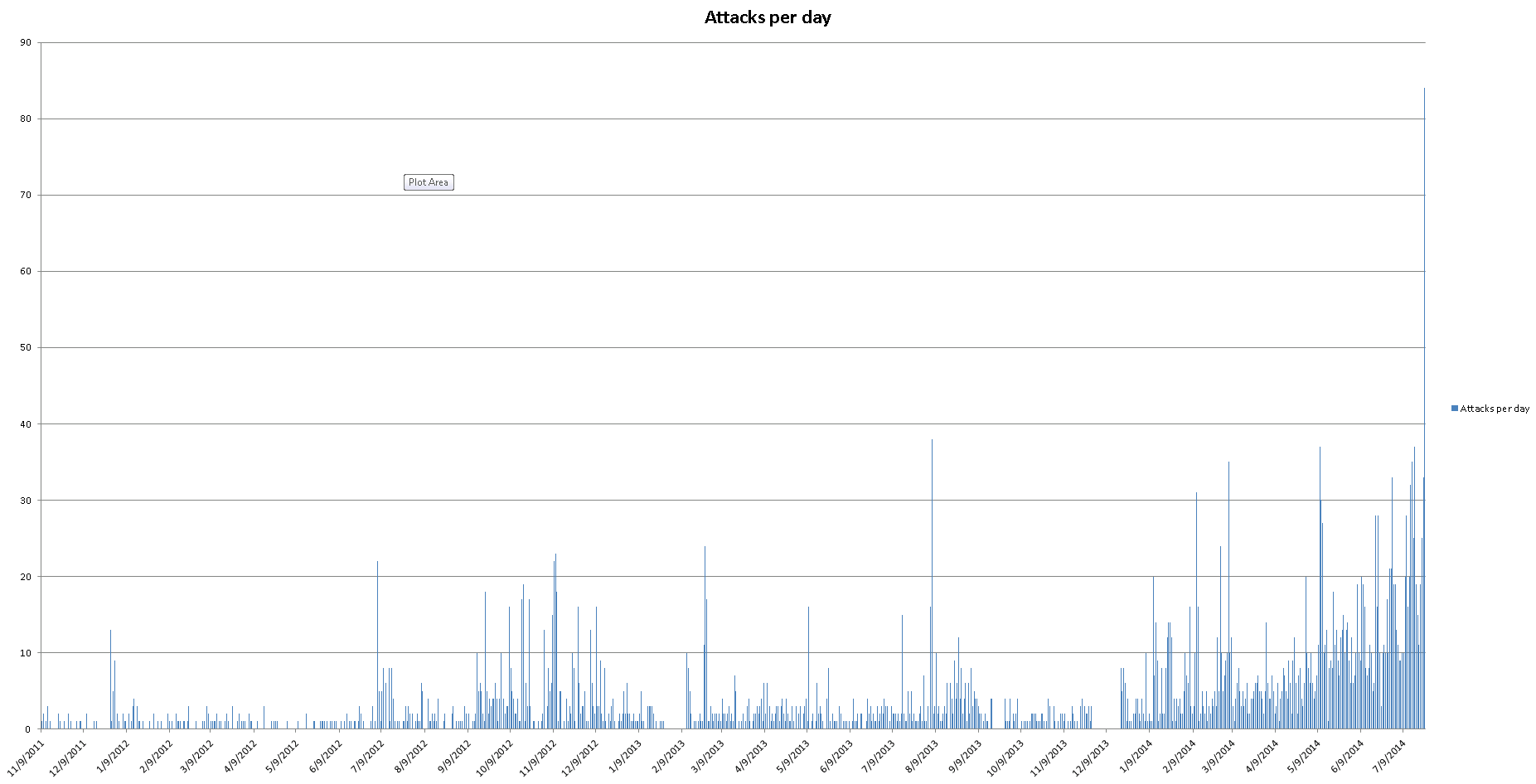
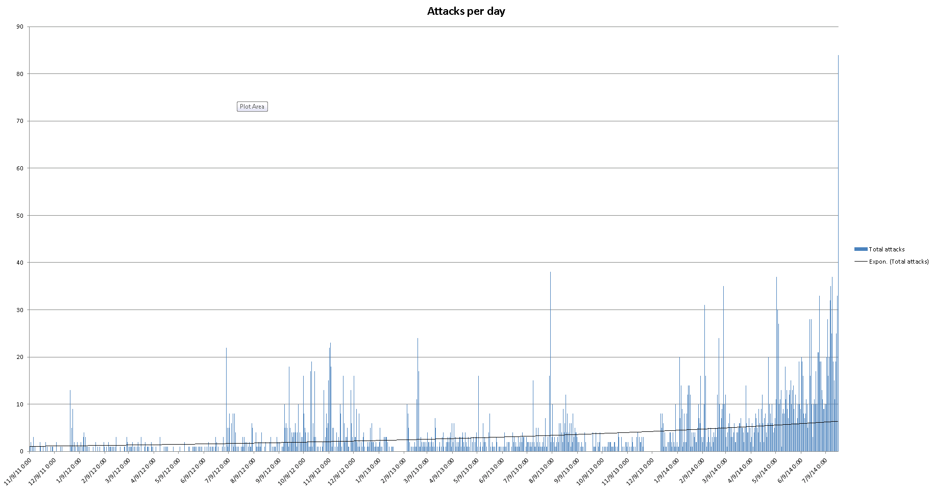
Nothing really all that surprising here. There's waves of heavy attacks and then relatively quiet periods. Some of these spikes could possibly be linked to times when certain exploits were widely used to compromise either servers or personal computers. Early July 2012, around the 9th of September, the end of February 2013, early August, February, March and May of 2014, etc. And most recently, a skyrocket today, July 24th. Here's another plot of the data that includes a trend-line.
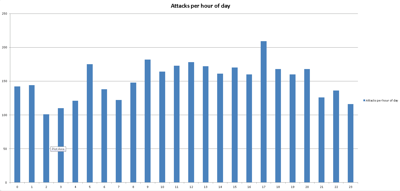
This is a graph of the total number of attacks by the hour of day. Something to notice is that the majority of attacks seem to happen at 5pm EST and the least at 2am EST. Since the attacking hosts are all over the world, only a small percentage being from the US (which reminds me, maybe I should write something to get the percentage of attacking hosts by country or something), it could be more telling that the time of day has more to do with whoever is initiating the attack than where the hosts are. Only a guess.
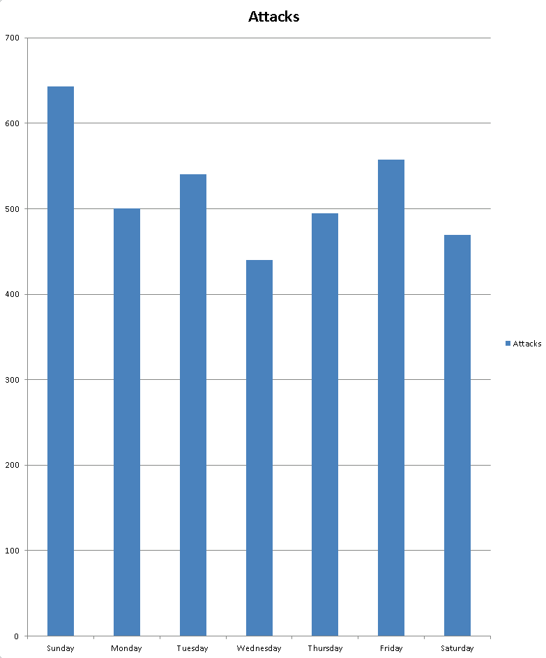
Finally, we have the total number of attacks per day of week. Back in the day, I used to think that a lot of attacks happen around the business hours of the targeted host to help mask the attacks, and that still may be the case sometimes, but seeing as how Sunday witnessed the most attacks seem to counter that notion. The least number of attacks seem to occur on Wednesdays, the middle of the work week. Ultimately, I'm not sure how much we can count on this kind of graph since the source data isn't very evenly distributed. A couple of flukey days could easily throw this off. None of this data can be authoritative in any way. This is only some mail servers that I run, it's not gmail or anything, though some of the domains that it hosts have been around for more than 15 years. This was just to satisfy my own curiosity, seeing as how I see this stuff in the logs constantly. I'll continue to run some stats and maybe make some more graphs in the future.
Filed under: Computers
HOME,CONTACT, TWITTER, |